Bachelor Degree in Graphic Design from Full Sail University expected December 2019.
Below, you’ll find examples of work I have created, from calendar pages to concert posters and holiday cards.
You may find it difficult to scroll past the puppies (talk about maximum cuteness overload, am I right or am I right?), but fortunately, unlike in real life, the puppies will stay and will be right where you left them!


My most recent project, outside of school, was creating a custom calendar for my mom and sister who recently just brought home Vizsla puppies, Chloe and Clay. Every year growing up, my mom made calendars as a Christmas present for our family that was focused on me and my sister throughout the year with photos from various events and with extended family — think of it as a next-level holiday card — but since we have grown up and moved out, the calendars have stopped since there is lack of content. With creating the calendar for the dogs, I have revived this tradition. Above are my favorite from the 12 spreads, I hope you can enjoy a good laugh!
Software used: Adobe Illustrator, Adobe InDesign and Adobe Photoshop


Working for CENTURY 21 Beggins Enterprises, a Real Estate brokerage with 11 offices across the Tampa Bay area, has provided me with ample opportunity to work with page layout through creating promotional/marketing material whether it be for the company, individual agents or the company’s auction division. Below is a preview of the brochure I created as requested by the auction division as a hand out to explain the process to prospective clients. The division had created a brochure (see the last image in the slideshow below) and were in agreement they were not satisfied and found it to be too wordy and hard to read. After re-arranging the layout to group like elements and cutting down on some of the wording, going back and forth with the team and seeing what ideas they liked or didn’t like, the final version showcased below was born. By using Photoshop, I was able to create a digital mock up to send to the auction team to help visualize the final product. Software used: Adobe InDesign and Adobe Photoshop
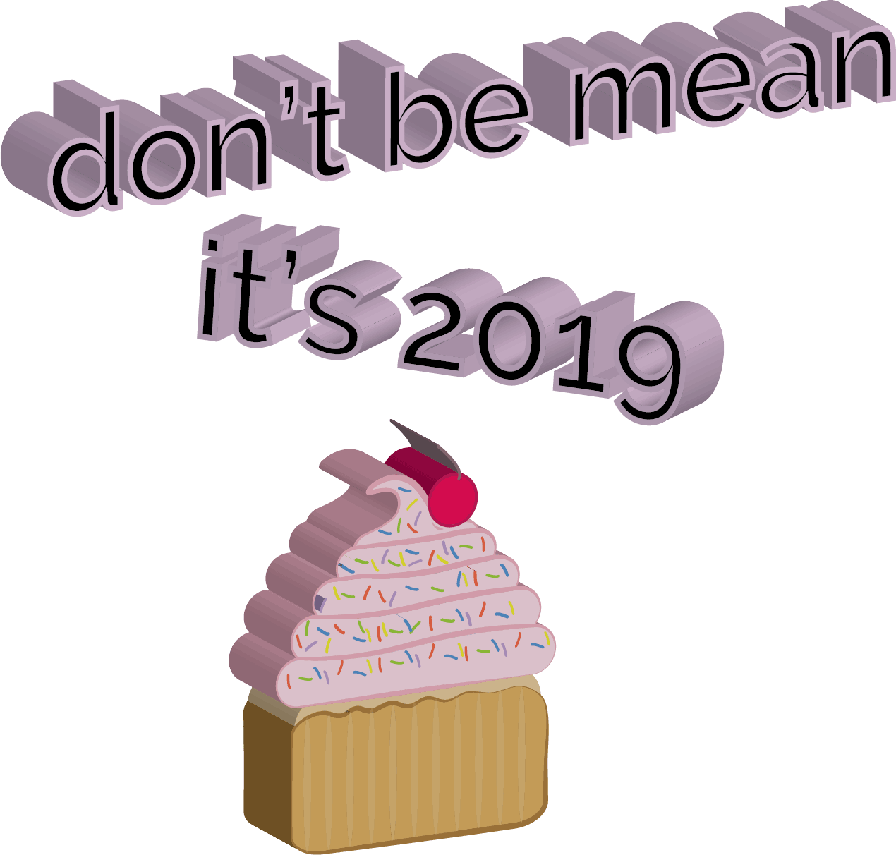
2019
“Don’t be mean, it’s 2019” gif
Software used: Adobe Illustrator and Adobe Photoshop
Logo Design Examples:


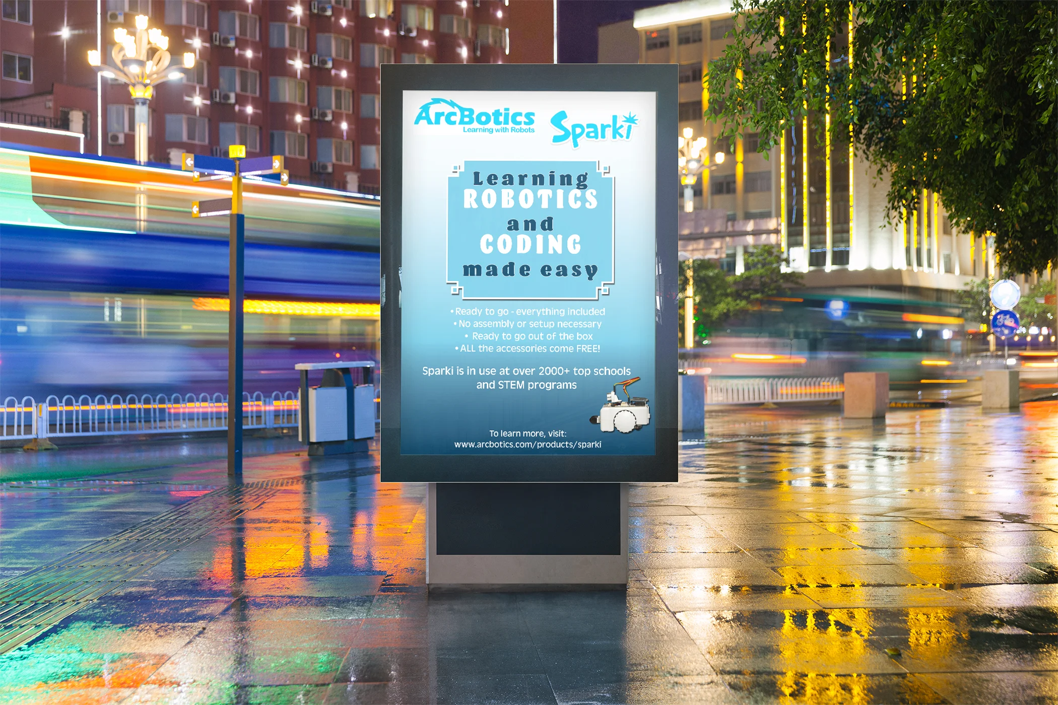
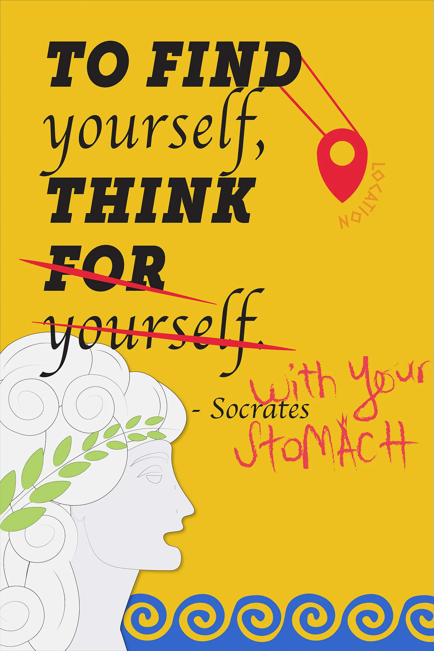
Poster Design/Flyer Examples:


#Kanye2020
A product of a class assignment to Illustrate a portrait of our hero for a t-shirt design while exploring different color relationships.


Mock Ups:


Mobile App Wireframe to Mock Up in Adobe XD


Play with an interactive version of this prototype here:
https://xd.adobe.com/view/39533d0d-9e3e-4190-5ae8-1edc42ff0a43-4f62/
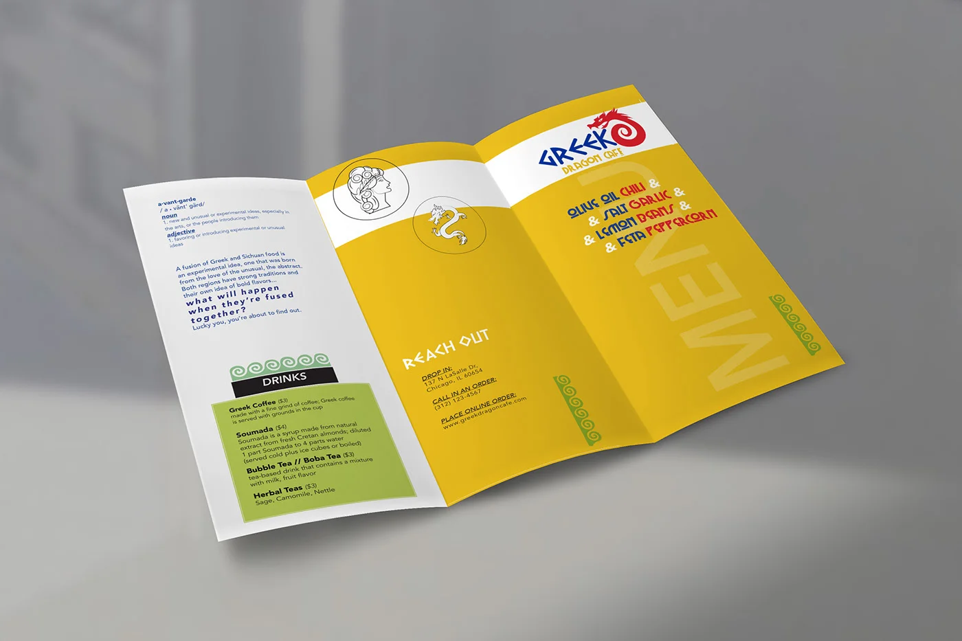
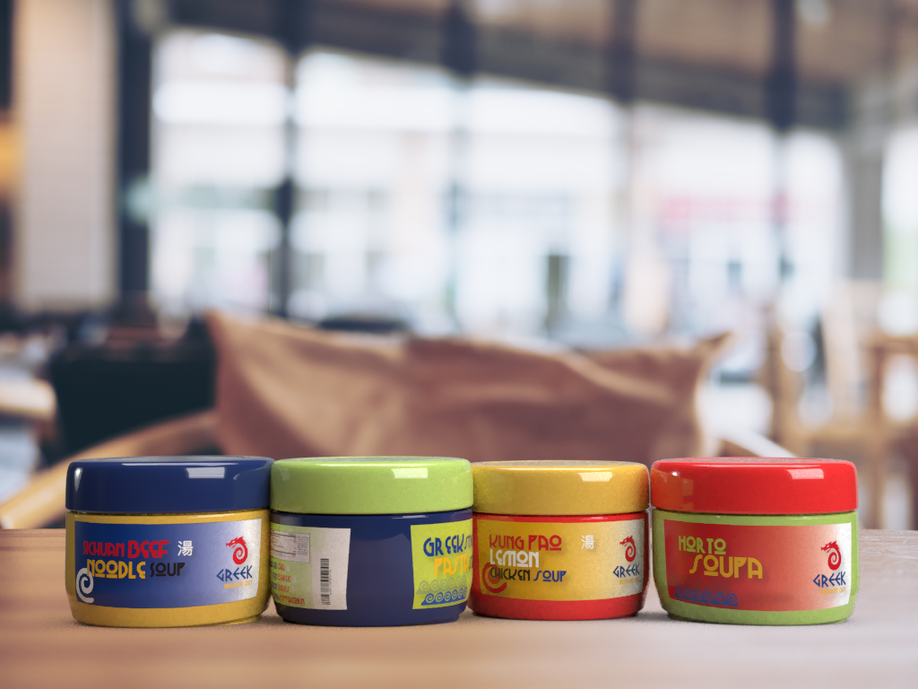
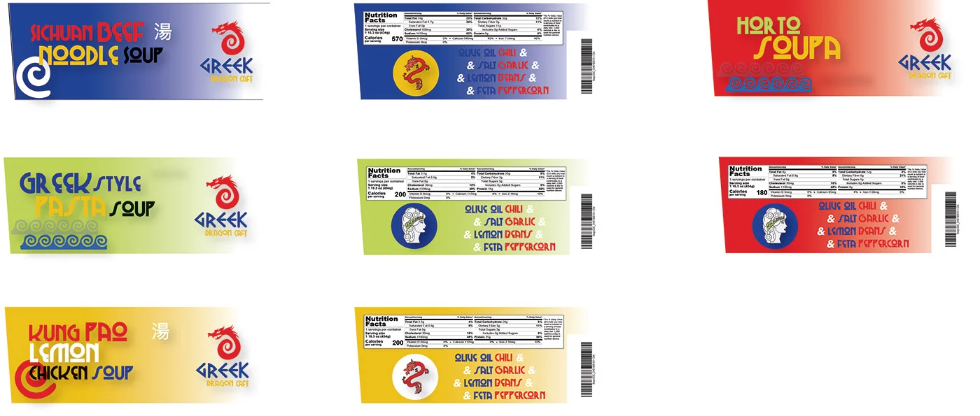
CAPSTONE: RESTAURANT BRANDING
CAPSTONE PROJECT / FULL SAIL UNIVERSITY / SAMANTHA BEGGINS
"CONTEXT:
You’re going to be taking on the responsibilities of launching and branding a fusion cuisine fast food or casual dining experience. Think along the lines of Red Robin or McDonalds and Chili’s or Olive Garden, but remixed. You will be challenged to think about designing something fresh, original, and innovative.
I chose to fuse Greek cuisine and Chinese/Sichuan cuisine with an avant-garde theme.
Searching for a common element in Greek and Chinese culture, the dragon stood out to me. Both cultures seemingly focus on the dragon from a mythological/folklore viewpoint, but the Chinese dragon stands out more as being apparent in today’s culture so I wanted the dragon to be more representative of a typical Chinese dragon, and chose to color fill it with red to also nod to the dominant Chinese color. After revisions and feedback, I brainstormed ideas of how to merge Greek culture into this dragon design, and pulled in the standard spiral design and merged it into being the tail of the dragon.
With the lettering, as Chinese is not easily understood by English speakers like Spanish or similar Latin languages are, and also since the dragon was more of a Chinese heritage, I pulled in the typical, strong Greek influenced type and pulled in a deep blue to further allude to the Greek influence.
A color common to both cultures is gold, as its seen as being noble and rich, so it rounded out the design. Although the restaurant is not expensive or high class, the cafe is still a nice establishment targeting young, professional city dwellers who could be considered “foodies” and/or artsy. A step above a fast food place, the bubbly, bold font appearance matches the informal and casual appearance of the restaurant’s brand.”


Passion Project: Holiday Cards/Graphics
Last holiday season, I wanted to create holiday cards, inspired by the Christmas cards everyone around me was preparing. Using my iPad and Adobe Draw app, I created illustrations for Christmas and Thanksgiving and used them in the front of the card designs. I’ve since done a few silly birthday designs or thank you designs. I think it would be fun to actually send these out one year, but I have not yet.


Passion Project: Iceland Zine
After my trip to Iceland in 2018, I was inspired to use my photographs and create a simple zine to reflect on my trip. Below is a preview of some spreads, the document as a whole was 28 or so pages filled with photos and written texts by me about the photos and the trip. I love page layout and this was a fun project that I had limitless options with to try out different things.


CENTURY 21 Beggins Enterprises:


I’m glad you made it past the puppies to the bottom. Thanks for looking!